


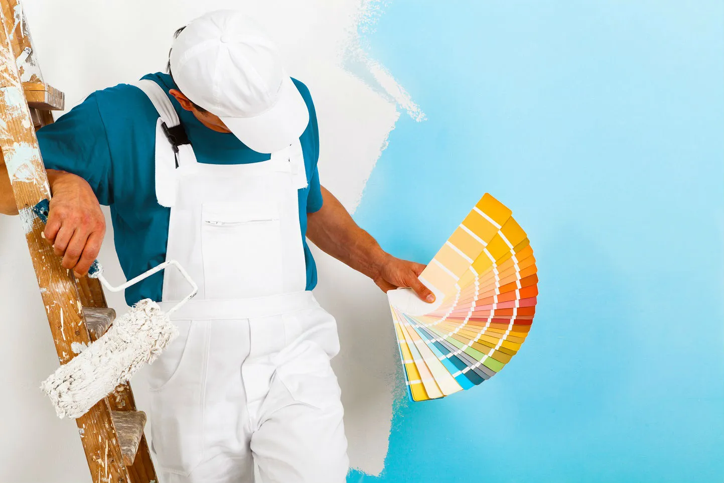
Have you ever walked into a room and felt your mood switch instantly without knowing why? It is not magic. It is color psychology! The idea that the colors around you can change how you feel is exciting. And when it comes to painting your home, choosing the right colors can make all the difference. It can either make your home feel cozy or really dull! You are probably getting ready to refresh your walls. This guide will help you understand why colors matter and how to pick the perfect shades for every room.
What is Color Psychology When Picking Paint
Grabbing a paintbrush and coloring your walls is not everything! It is important to realize that color does more than make a room look “pretty.” Color changes mood. Color changes energy. Color even changes how big or small a room feels.
The problem many people run into is choosing a color they think they will love. Then, realizing it makes their space feel too intense, too bland, too dark, or just “not right.” This is where people realise the importance of color psychology. Once you know what each color makes you feel, choosing paint becomes so much easier.

Warm Colors
Warm colors are the “social” colors. They make a room feel lively and inviting. Warm colors are powerful, so a little goes a long way. They work great as accent walls or small pops of color.
Red → Energy and excitement. It is great for dining rooms if you want lively conversations. However, it can feel overwhelming in a bedroom.
Orange → Fun and creative. It is used in playrooms or home gyms because it boosts motivation.
Yellow → Sunshine indoors. Light yellow can make kitchens and entryways feel happy.
Cool Colors
Cool colors are the “chill” group. The blues, greens, and purples just scream coolness. These colors help you relax and slow down. They are perfect when you want a space to feel soft and airy.
Blue → Calming and peaceful. It is one of the best paint choices for bedrooms and bathrooms because it helps create a spa-like feel.
Green → Balanced. It works pretty much anywhere because it feels refreshing and calming at the same time. You will find it in living rooms, bedrooms, and home offices.
Purple → A sense of luxury. Light purple is soothing. Deep purple creates a rich, dramatic vibe.
Neutral Colors
Neutrals are the safe but stylish choice. The best thing about neutrals is that they play nicely with all other colors. They are perfect if you love switching up décor or adding bold accent pieces.
White → Makes a room feel bright and clean. It also reflects light really well. This color makes small rooms look bigger.
Beige → Warm! It is such a classic choice for living rooms or hallways.
Gray → Modern and elegant. Light gray feels soft and relaxing. Dark gray adds depth.
How to Pick the Right Color Psychology for Each Room
Think about how you want each room to feel instead of randomly choosing colors.
Let’s help you out with what we believe would be the best color Psychology combinations:
| PLACES | VIBE | COLORS |
| Bedroom | Relaxing | Light blues, greens, or soft neutrals |
| Kitchen | Cheerful | Warm whites, light greens |
| Living room | Comfortable and stylish | Neutrals with pops of warm or cool tones |
| Bathroom | Refreshing | Whites, blues, or soft pastels |
| Home office | Focused and balanced | Greens or muted blues |
The concept of lightning
Always remember to keep lighting in mind. Natural sunlight can make colors look brighter, and warm light bulbs can make colors look more yellow. Always test your paint in different lighting before committing.
In a Nutshell
The color paint in any room shapes how you feel in that space. Choosing paint is more than just about decorating. By using color psychology, you can turn every room in your home into a place that matches your mood and lifestyle. The right color can completely transform the atmosphere, whether you want calm, cozy, energizing, or elegant.
FAQ
Is color psychology a real science?
Yes, color psychology is considered an applied science, though it sits at the intersection of psychology, design, and marketing. It studies how colors influence human behavior, emotions, and perceptions. Research shows that color can affect mood, decision-making, and even physiological responses like heart rate or appetite. For example, warm colors like red can increase energy or urgency, while cool colors like blue can promote calmness and focus. However, responses to color can also be subjective, influenced by personal experiences, culture, and context, which means while it’s a science-based field, it is not always exact or universal.
What are the 4 colors of psychology?
The four primary colors in psychology—red, yellow, blue, and green—are often used to symbolize core aspects of human experience and emotion. Each color is linked to certain psychological effects:
- Red: Energy, passion, excitement, and urgency.
- Yellow: Optimism, happiness, and creativity.
- Blue: Calmness, trust, intelligence, and reliability.
- Green: Balance, harmony, growth, and renewal.
These colors serve as foundational references in design, branding, and therapeutic environments, helping to evoke or influence emotional responses.
Which color represents intelligence?
The color most widely associated with intelligence, wisdom, and logical thinking is blue. Studies suggest that blue can enhance focus, productivity, and mental clarity. It is often used in educational materials, offices, and tech branding to evoke trust, knowledge, and professionalism. Light blues can feel refreshing and promote calm problem-solving, while darker blues convey authority and sophistication.
Which color to avoid in a bedroom?
When designing a bedroom, it’s best to avoid highly saturated or overly stimulating colors such as:
- Vibrant red: Can increase heart rate and create tension.
- Bright yellow: May feel too energizing or harsh.
- Orange: Can feel intense and may disturb restful sleep.
Instead, muted tones like soft blues, greens, lavenders, or neutral shades are recommended, as they promote relaxation, calmness, and better sleep quality.
What does a black room make you feel like?
A black room can evoke a variety of feelings depending on how it’s used. On one hand, black conveys drama, sophistication, and elegance. When paired with warm lighting, soft textures, or metallic accents, a black room can feel cozy, calming, and intimate. On the other hand, if poorly lit or overly stark, black can feel oppressive, cold, or isolating. Its psychological impact relies heavily on balance with light, furniture, and accent colors.